Federated Hermes
Redesigning a global investment site with a scalable design system and CMS
Redesigning a global investment site with a scalable design system and CMS

Role:
Lead Product Designer
Team size:
12 people
Timeline:
18 months
Core tools:
Figma · Optimizely · Storybook · Hotjar
Overview
The problem
Federated Investors and Hermes Investments merged in 2018, and the combined web presence inherited every inconsistency from both. Regional teams across 20+ countries had been building their own pages on their own systems, which produced very different styles, hierarchies, and content structures, along with compliance gaps and accessibility failures that had already drawn ADA litigation.
Underneath the brand problem was a usability one. Financial professionals and individual investors weren't coming to browse. They arrived with a specific task, usually finding a particular data point on a particular fund. The product pages that mattered most to them were the densest and hardest to parse, and navigation changed depending on the region you were in.
Federated Investors and Hermes Investments merged in 2018, and the combined web presence inherited every inconsistency from both. Regional teams across 20+ countries had been building their own pages on their own systems, which produced very different styles, hierarchies, and content structures, along with compliance gaps and accessibility failures that had already drawn ADA litigation.
Underneath the brand problem was a usability one. Financial professionals and individual investors weren't coming to browse. They arrived with a specific task, usually finding a particular data point on a particular fund. The product pages that mattered most to them were the densest and hardest to parse, and navigation changed depending on the region you were in.
The solution
We rebuilt the site around task completion instead of brand storytelling. I designed a global design system and a set of page templates in Optimizely that gave every region the same predictable structure, with a familiar IA modeled on sector conventions and sub-navigation on long fund pages so users could jump to the data they came for.
Accessibility was built into every component rather than caught at QA, which meant regional teams could author thousands of pages without introducing compliance issues. Content adapts by country, language, and visitor role through translation and fallback logic in the CMS.
We rebuilt the site around task completion instead of brand storytelling. I designed a global design system and a set of page templates in Optimizely that gave every region the same predictable structure, with a familiar IA modeled on sector conventions and sub-navigation on long fund pages so users could jump to the data they came for.
Accessibility was built into every component rather than caught at QA, which meant regional teams could author thousands of pages without introducing compliance issues. Content adapts by country, language, and visitor role through translation and fallback logic in the CMS.
Key outcomes
10,000+
10,000+
pages authored across 20 countries and 8 languages
pages authored across 20 countries and 8 languages
34%
34%
decrease in drop-off rate after launch
decrease in drop-off rate after launch
100%
100%
WCAG 2.1 AA and GDPR compliance at launch
WCAG 2.1 AA and GDPR compliance at launch
10,000+
pages authored across 20 countries and 8 languages
34%
decrease in drop-off rate after launch
100%
WCAG 2.1 AA and GDPR compliance at launch
Research & discovery
Understanding the problem
I worked with our researcher on interviews with 30 financial professionals and individual investors, plus 8 internal stakeholders across both legacy brands. We ran a competitor analysis to benchmark IA conventions in the sector and a Hotjar heatmap study of the existing site. The overall picture showed that this was a destination for looking something up, and the existing structure was working against that.
I worked with our researcher on interviews with 30 financial professionals and individual investors, plus 8 internal stakeholders across both legacy brands. We ran a competitor analysis to benchmark IA conventions in the sector and a Hotjar heatmap study of the existing site. The overall picture showed that this was a destination for looking something up, and the existing structure was working against that.

Key findings
Across 30 user interviews and heatmap analysis of the live site, the same pattern held. Users treated the site as a reference tool with a single question in hand. Inconsistent regional navigation meant the path to an answer changed depending on the market, and dense product pages with no sub-navigation forced people to scan long documents visually. When the site failed them they went to a third-party aggregator, and the firm lost both the relationship and any control over how its own data was presented.
Across 30 user interviews and heatmap analysis of the live site, the same pattern held. Users treated the site as a reference tool with a single question in hand. Inconsistent regional navigation meant the path to an answer changed depending on the market, and dense product pages with no sub-navigation forced people to scan long documents visually. When the site failed them they went to a third-party aggregator, and the firm lost both the relationship and any control over how its own data was presented.
Retrieval, not exploration
Nearly every user arrived with one specific question, usually about a single fund's performance or holdings. Those product pages were the most valuable content on the site and the hardest to use, dense with required disclosure and no internal wayfinding. Users scrolled past what they needed or gave up and went elsewhere.
The homepage wasn't the front door
Heatmaps showed most sessions bypassed the homepage entirely. Users came through bookmarks and deep links straight to pages they'd used before, which meant navigation and page-level structure mattered far more than any homepage hierarchy we could design.
Retrieval, not exploration
Nearly every user arrived with one specific question, usually about a single fund's performance or holdings. Those product pages were the most valuable content on the site and the hardest to use, dense with required disclosure and no internal wayfinding. Users scrolled past what they needed or gave up and went elsewhere.
The homepage wasn't the front door
Heatmaps showed most sessions bypassed the homepage entirely. Users came through bookmarks and deep links straight to pages they'd used before, which meant navigation and page-level structure mattered far more than any homepage hierarchy we could design.
Design process
Starting off on the right foot
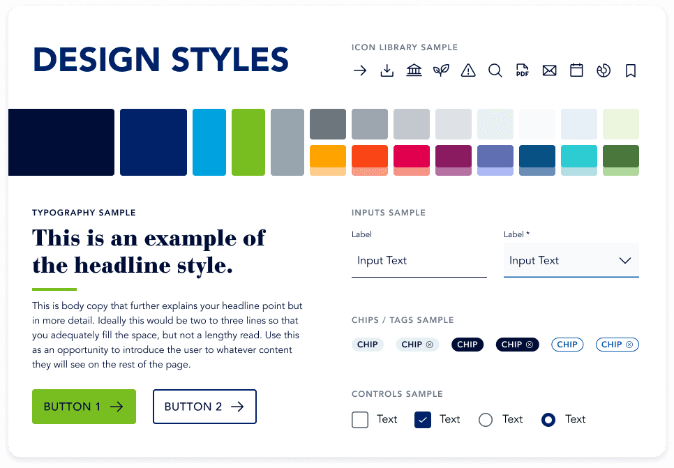
I designed the full system myself, starting with style tiles to settle the merged visual language and working through atomic design from tokens up to page templates. Accessibility was built into every component instead of checked afterward, with documented focus states, WCAG 2.1 AA contrast, and defined behavior for responsive breakpoints and multilingual text expansion. I validated each template against the messiest real content I could find, since a fund page in one market carries a very different volume of disclosure than the same page in another.
I designed the full system myself, starting with style tiles to settle the merged visual language and working through atomic design from tokens up to page templates. Accessibility was built into every component instead of checked afterward, with documented focus states, WCAG 2.1 AA contrast, and defined behavior for responsive breakpoints and multilingual text expansion. I validated each template against the messiest real content I could find, since a fund page in one market carries a very different volume of disclosure than the same page in another.
Design solutions
The system shipped as 48 components and 15 page templates in Optimizely, covering the homepage, About, Insights, Capabilities, and the full fund and product set.
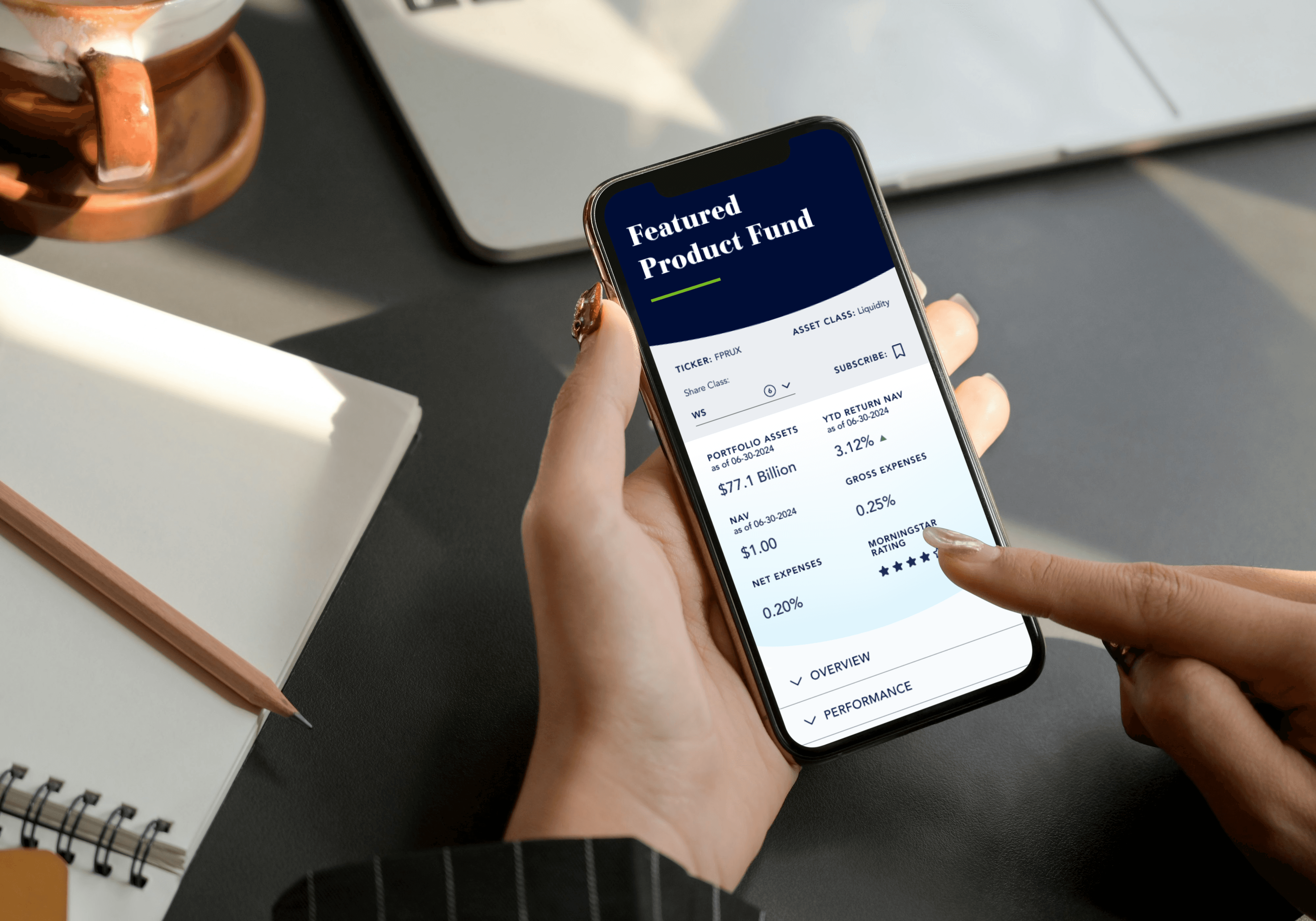
The changes that mattered most to users were structural. Navigation moved to a simpler IA modeled on conventions people already knew from competitor sites, since familiarity beat distinctiveness for an audience arriving with a task in hand. Long fund pages gained sub-navigation so someone hunting a single performance figure could jump straight to it. Because most sessions bypassed the homepage, every page was designed to work as an entry point on its own.
For the digital team, the CMS handles localization through translation and fallback logic, so regional authors publish in their own market without duplicating work or breaking consistency.
I led content migration in the final phase, reframing legacy content to fit the new structure, managing the client-side migration team, and documenting every component and page type in Confluence. 10,000+ pages across 20 countries and 8 languages.
The system shipped as 48 components and 15 page templates in Optimizely, covering the homepage, About, Insights, Capabilities, and the full fund and product set.
The changes that mattered most to users were structural. Navigation moved to a simpler IA modeled on conventions people already knew from competitor sites, since familiarity beat distinctiveness for an audience arriving with a task in hand. Long fund pages gained sub-navigation so someone hunting a single performance figure could jump straight to it. Because most sessions bypassed the homepage, every page was designed to work as an entry point on its own.
For the digital team, the CMS handles localization through translation and fallback logic, so regional authors publish in their own market without duplicating work or breaking consistency.
I led content migration in the final phase, reframing legacy content to fit the new structure, managing the client-side migration team, and documenting every component and page type in Confluence. 10,000+ pages across 20 countries and 8 languages.

Impact
Reflection
The most useful thing research did on this project was kill an assumption. We came in expecting to design a homepage-led brand experience for two merged identities, and the data said almost nobody sees the homepage. People arrive deep, with one question, often from a bookmark they saved years ago.
Reframing around that changed the priorities. A familiar, fairly boring IA modeled on sector conventions beat anything distinctive. Sub-navigation on long fund pages did more for users than any visual refinement would have. And building accessibility into the components meant 10,000+ pages could be authored by people who aren't accessibility specialists without regressions.
If I revisited it, I'd push harder on automated accessibility validation inside the authoring flow, and I'd instrument the fund pages from day one to measure time to answer instead of time on page.
The most useful thing research did on this project was kill an assumption. We came in expecting to design a homepage-led brand experience for two merged identities, and the data said almost nobody sees the homepage. People arrive deep, with one question, often from a bookmark they saved years ago.
Reframing around that changed the priorities. A familiar, fairly boring IA modeled on sector conventions beat anything distinctive. Sub-navigation on long fund pages did more for users than any visual refinement would have. And building accessibility into the components meant 10,000+ pages could be authored by people who aren't accessibility specialists without regressions.
If I revisited it, I'd push harder on automated accessibility validation inside the authoring flow, and I'd instrument the fund pages from day one to measure time to answer instead of time on page.