AI Analysis Dashboard
Partnering with Google Cloud’s Contact Center AI (CCAI) team, I designed a proof-of-concept dashboard that automated the analysis of customer service conversations. The system transformed unstructured transcripts into actionable insights on agent performance, customer sentiment, and training opportunities.
Challenge
Customer service teams often spend hours manually reviewing call transcripts to assess quality, identify training gaps, and monitor agent performance. The client’s existing QA process was time-consuming, inconsistent, and prone to bias.
The goal was to explore how AI and conversation analytics could uncover deeper insights faster, enabling more targeted coaching and improved customer experiences.
We partnered with Google Cloud’s Contact Center AI (CCAI) group to develop a proof of concept (PoC) demonstrating how conversation data could be visualized in a clear, human-centered dashboard.
Goals
Automate conversation analysis using Google CCAI.
Visualize sentiment, agent performance, and conversation trends through interactive dashboards.
Help teams identify training opportunities quickly and objectively.
Present findings clearly to Google Cloud and client stakeholders.
Constraints
Limited project scope — proof-of-concept within 12 weeks.
Data models were still in training, requiring flexibility in how metrics were represented.
Dashboards had to balance technical accuracy with clarity
Research
Collaborating with the data scientist, I worked to define:
Key topics and keywords for the CCAI model to analyze.
The QA rubric that scored conversation quality.
The data hierarchy for how results should appear in dashboards (overall, by agent, by conversation).
Through stakeholder interviews and feedback sessions, we learned:
QA analysts wanted faster visibility into recurring coaching issues.
Managers needed both high-level trends and drill-down capability.
Sentiment analysis had to be contextual — an angry customer isn’t always a sign of poor agent performance.
These insights drove our focus on layered dashboards that allowed users to start broad and explore detail as needed.
Design Process
I explored visualization frameworks that could make large amounts of conversation data intuitive.
My process included:
Creating information architecture diagrams to structure dashboards around user needs.
Prototyping data visualizations in Figma and Looker Studio.
Collaborating with the Google Cloud team to refine model output categories.
Testing visual prototypes with internal stakeholders for comprehension and clarity.
Key design principles:
Clarity over complexity: Emphasize what matters, avoid over-charting.
Traceability: Allow users to connect aggregated insights back to individual transcripts.
Human + AI: Keep the human analyst in the loop while automating manual work
“I wanted to call out how amazing Angie’s work has been. I was really impressed with her presentation skills and preparedness during the final readout, along with how well she’s taken feedback and actioned on it.”
– Account Manager, Google Cloud
Solution
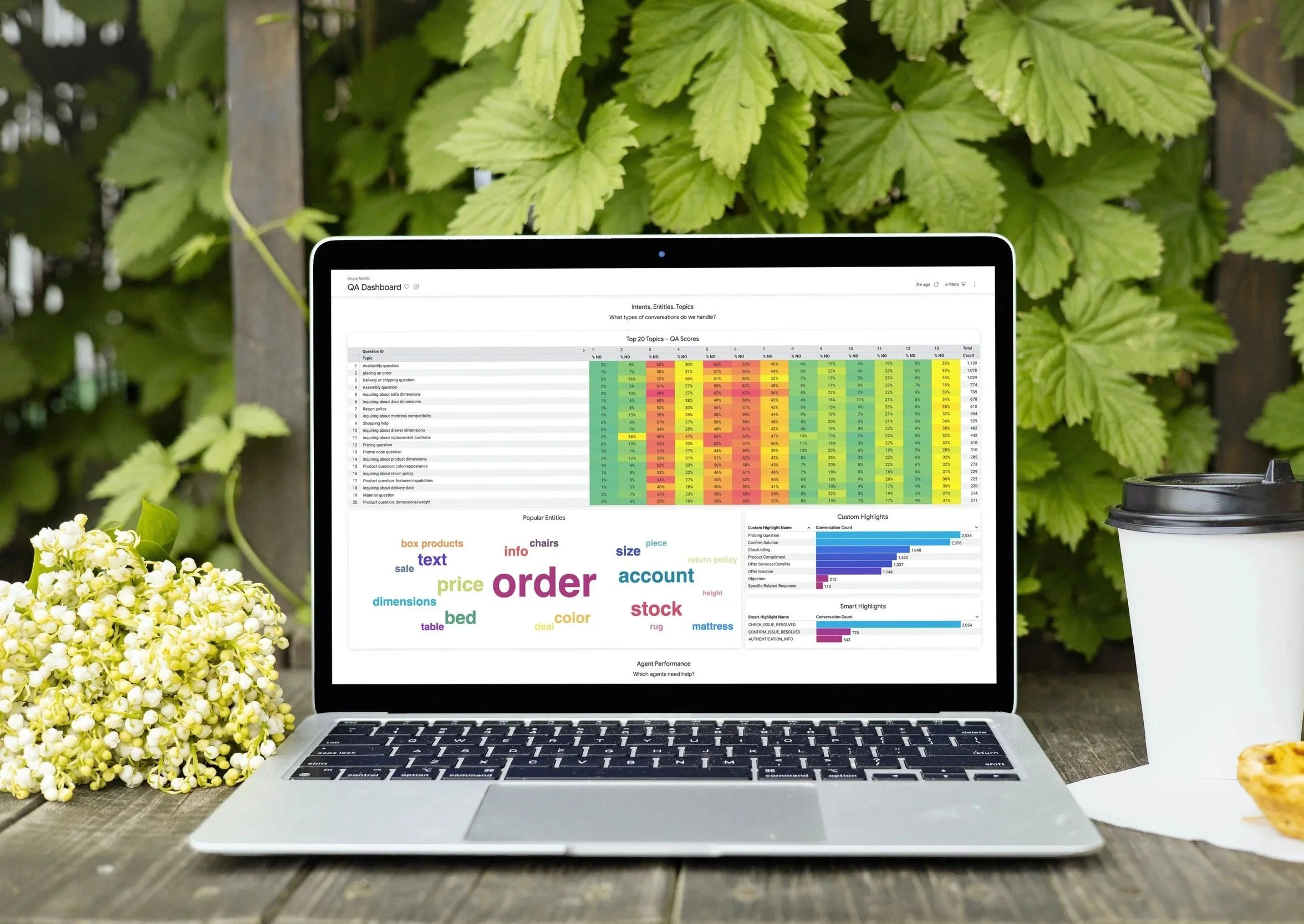
The final PoC included three connected dashboards:
Overview Dashboard
A heatmap mapping QA rubric questions to analyzed conversation topics.
Aggregate sentiment trends for customers and agents.
Overall agent performance metrics with filtering by region or team.
Agent Performance Dashboard
Individual agent summaries highlighting strengths, improvement areas, and average sentiment.
Comparative insights to identify coaching opportunities.
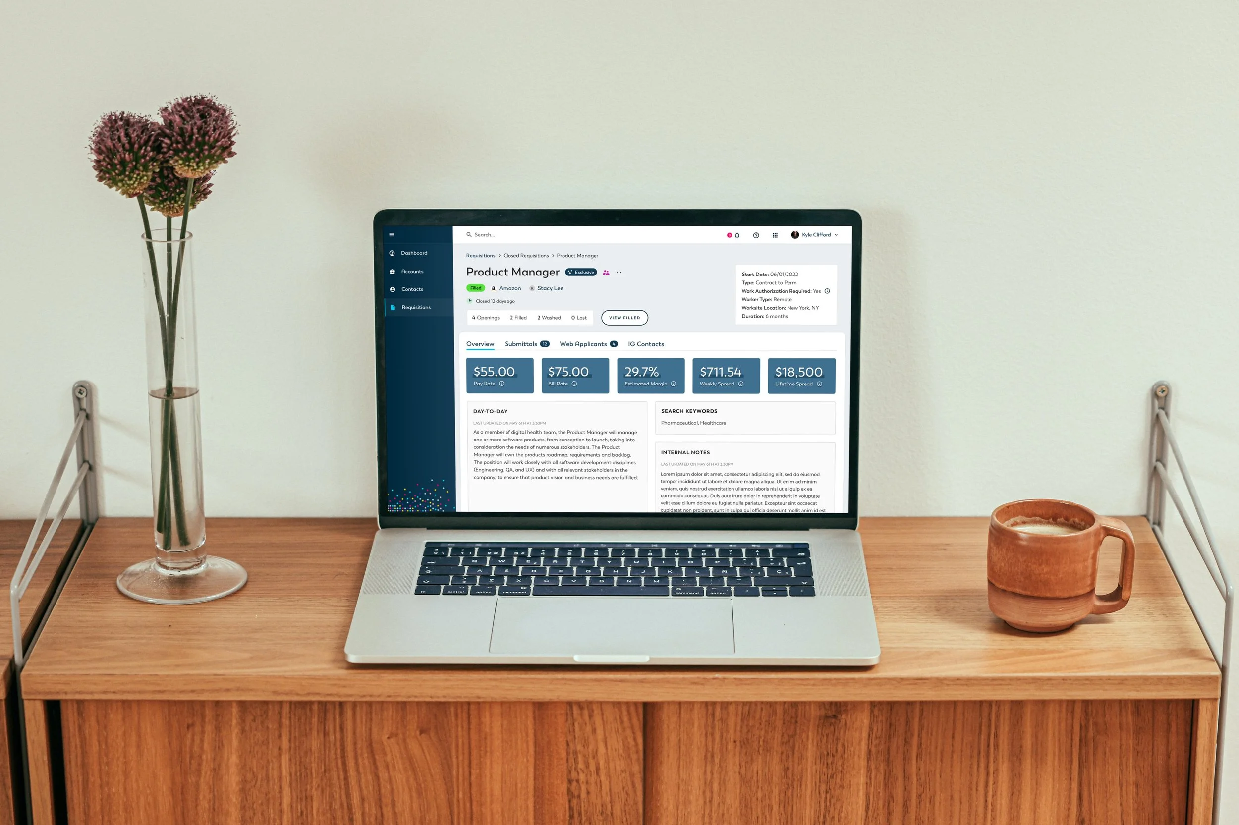
Conversation Lookup Dashboard
Searchable transcript view linked to analytics context (sentiment scores, topics discussed, and QA performance).
Enables reviewers to validate AI findings against real dialogue data.
The visual design balanced a clean, enterprise look with color-coded sentiment and accessibility-compliant contrast ratios.
Although the client ultimately chose to pursue a manual analytics service, the PoC was viewed as successful in demonstrating the potential of AI-driven QA analysis.
Reduced manual transcript review time by an estimated 60% during testing.
Revealed previously unseen patterns in customer frustration and agent responses.
Sparked internal discussions about bias reduction and training optimization.
Reflection
This project reinforced the importance of designing clear, interpretable AI interfaces — tools that help users trust and act on machine-generated insights. It also deepened my collaboration experience with cross-disciplinary teams — translating complex data models into visual systems that feel intuitive and reliable.
If expanded, I’d explore integrating real-time insights and confidence indicators to help analysts understand AI accuracy at a glance. Ultimately, this work showed how thoughtful design can bridge the gap between raw data and human understanding.
Keep Exploring
Custom CRM Platform
Finance Mobile App