UX Research
When users can’t find what they need, they leave. That was the core issue facing one of our web products: low engagement and high bounce rates due to poor navigation. I led a user-centered research initiative to uncover the root causes of these issues. This case study focuses on how deep research practices—interviews, behavioral analytics, and testing—directly informed insights that drove major improvements.
Industries
FinTech | Healthcare | B2C
Tools
Figma | Miro | User Testing | HotJar | Dovetail | Optimal Workshop
The Challenge
We were tasked with improving the usability of a new website and informing the design process through user research.
Analytics and stakeholder feedback highlighted a usability problem, but data alone couldn't explain why users were struggling. We needed a research-driven approach to:
Understand users' mental models and expectations.
Uncover where and why users became frustrated.
Validate hypotheses about content discoverability issues.
Research Process
-
I conducted stakeholder interviews with marketing, customer support, and product teams to:
Identify critical business needs.
Prioritize areas of focus for user research.
Define success metrics for navigation improvements.
This initial discovery ensured that user research would be targeted and actionable.
-
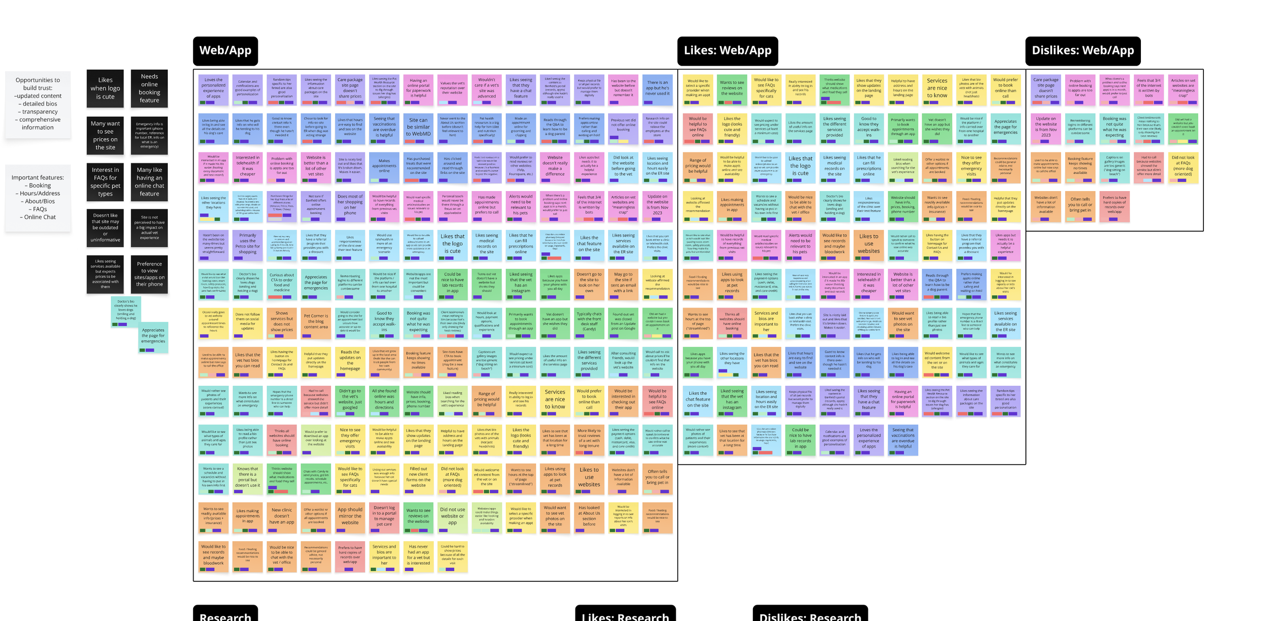
To uncover user needs and behaviors, I:
Conducted 12 semi-structured interviews with new, returning, and power users.
Analyzed heatmaps and session recordings to spot patterns of confusion and frustration.
Mapped user journeys highlighting points where users hesitated, backtracked, or abandoned tasks.
Key findings:
Users expected navigation organized around task completion, not internal team structures.
Vague or unfamiliar labels created hesitation and guessing behavior.
Users often overlooked important features buried in secondary menus.
-
Armed with insights, I:
Conducted open card sorts (30 participants) to understand users' natural categorization.
Ran closed card sorts to validate proposed structures.
Launched tree tests to measure findability, success rates, and task times.
Results:
Confirmed clearer, task-based groupings.
Identified redundant or confusing terminology.
Prioritized high-traffic content for top-level navigation.
-
I synthesized findings into:
User journey pain point maps.
A revised sitemap grounded in user expectations.
Clear labeling guidelines for content creators and marketing teams.
These research-backed recommendations shaped the next phases of design and development.
The Impact
Bounce rate on key pages dropped by 38% post-navigation update.
Task success rates in usability testing increased by 52%.
Support tickets related to "can't find" issues decreased by 40%.
Stakeholders had a clear, research-backed roadmap for future IA improvements.
More importantly, the research process itself built stronger alignment between product, marketing, and support teams around user needs.

Research doesn’t just inform design—it drives clarity, alignment, and confidence. This project demonstrated the power of foundational UX research in diagnosing problems and creating actionable solutions that directly improved user experience.
When we listen deeply, analyze rigorously, and synthesize thoughtfully, we can transform confusion into clarity and build products that truly work for users.